


During Academy Week, our colleague Neeltje delivered a MasterClass on dashboard design. She would like to share a few tips with everyone who unfortunately could not attend.
When designing dashboards, themes, and documents, we often focus on branding, appearance, and recognizability. That is perfectly understandable. But did you know that an attractive color combination is not always an accessible one? A dashboard or document that is perfectly readable for you may be difficult for someone else to interpret. This can be due to personal characteristics, but also to the way employees use different screens, laptops, tablets, and mobile devices.
Brightness, contrast, display settings, and ambient lighting can all affect how colors appear on different devices. That is why, when designing your environment, it is important to consider not only aesthetics but also contrast and color blindness.
Before rolling out a new theme, dashboard, or document style, make sure to test your color choices for both contrast and color blindness. In most cases this only takes a few minutes, but it can prevent important information from becoming less visible to part of your audience.
Why is This Important?
Approximately 1 in 12 men and 1 in 200 women have some form of color blindness. In addition, many employees work across different screens, tablets, and mobile devices, which can display colors differently.
If important information is distinguished only by color, there is a risk that some users will miss it. For example:
- Red and green status indicators that are difficult to tell apart
- Light gray text on a white background
- Charts that use colors that are hard to distinguish from one another
- Warnings indicated by color alone
A well-designed, accessible interface ensures that everyone can understand information clearly and quickly.
Three Tips for Effective Color Use
1. Pay attention to color contrast
Sufficient contrast makes text, icons, and buttons easier to read. This is important not only for people with visual impairments, but also for anyone working on a less bright screen or in direct sunlight.
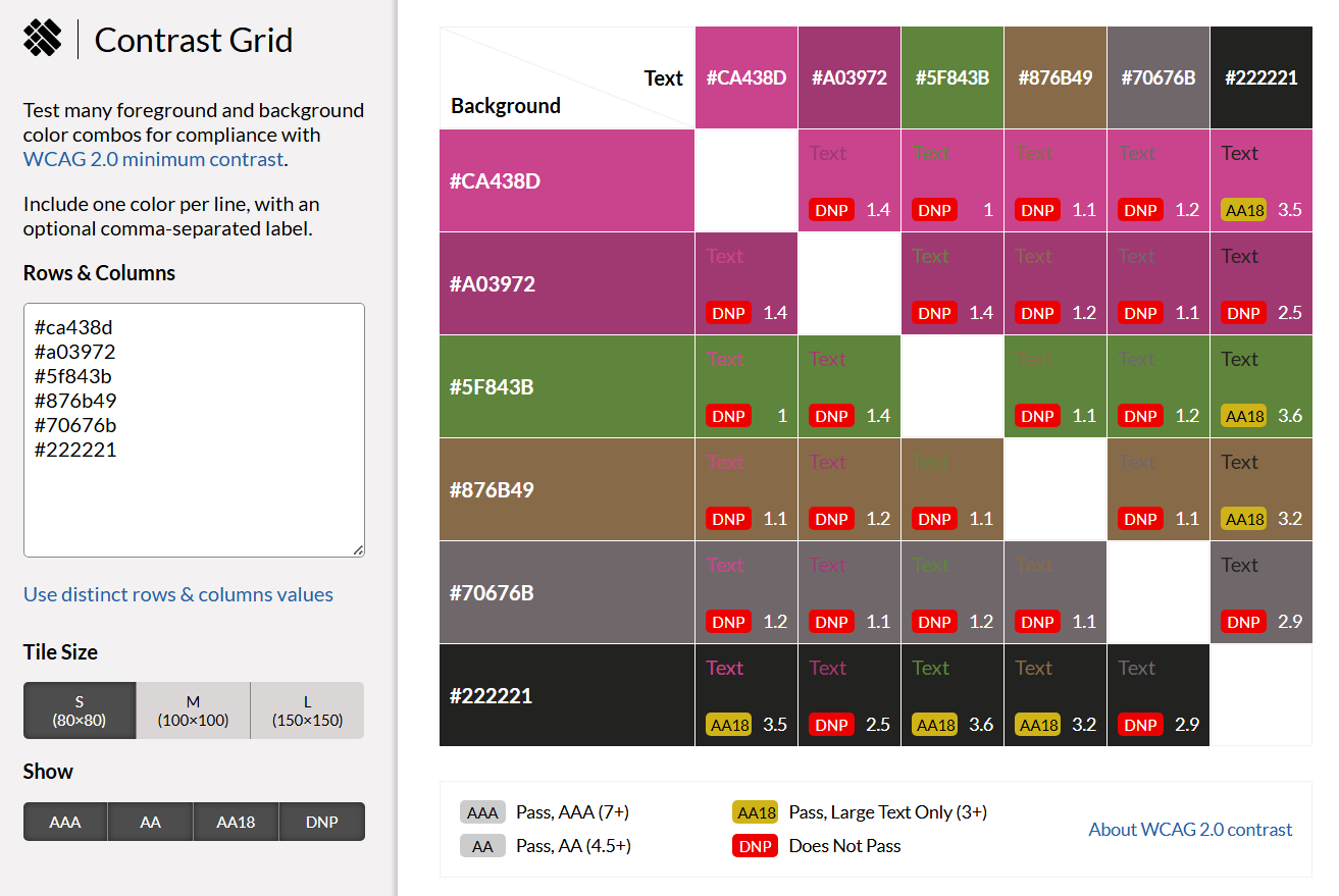
You can easily check your color combinations with the EightShapes Contrast Grid. This tool quickly shows which combinations meet accessibility guidelines and provides an immediate visual impression of how colors work together. It is especially useful when designing dashboards and user interfaces.
With WhoCanUse, you can also see how a color combination is experienced by different user groups, including people with visual impairments or color blindness. The tool not only provides accessibility scores but also simulates what the interface looks like for different users.
2. Test for color blindness
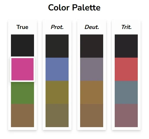
A color that appears clear and distinct to you may look almost identical to another color for someone with color blindness. Red and green combinations are particularly problematic, but blue and purple or yellow and green can also cause difficulties.
With Coloring for Colorblindness, you can check how your design appears under different types of color blindness. This allows you to quickly determine whether important information remains recognizable.
It is also important to remember that color blindness is not the only challenge. Age, reduced visual acuity, and fatigue can all affect how colors are perceived.
3. Never rely on color alone to convey meaning
An accessible interface uses color as a supporting element, not as the sole source of information. Always combine colors with:
- Icons
- Symbols
- Labels
- Text
For example, a green checkmark accompanied by the text “Approved” is much clearer than a green box alone. Error messages are also easier to understand when a red color is paired with a warning icon and a short explanation.
A Better User Experience for Everyone
Accessible color usage is not only important for people with disabilities. Users viewing screens in bright daylight, working with projectors, or simply dealing with eye fatigue after a long workday also benefit from clear contrast and consistent color application.
A good user interface uses color deliberately: to reinforce information, not replace it. The result is an interface that is more effective, reliable, and pleasant for everyone.
What’s Next?
We hope that the advice above helps you design dashboards that are accessible and fit you company’s branding. Would you like some help from our consultants? Let us know at info@manualmaster.com and we’ll get in touch!